I came across this from an article in The Paris Review about the novel and I’m pretty speechless. I welcome analysis
(For what it’s worth, Arnold Bennett was a very well-known and admired older writer at the time.)

I came across this from an article in The Paris Review about the novel and I’m pretty speechless. I welcome analysis
(For what it’s worth, Arnold Bennett was a very well-known and admired older writer at the time.)
You must be logged in to post a comment.
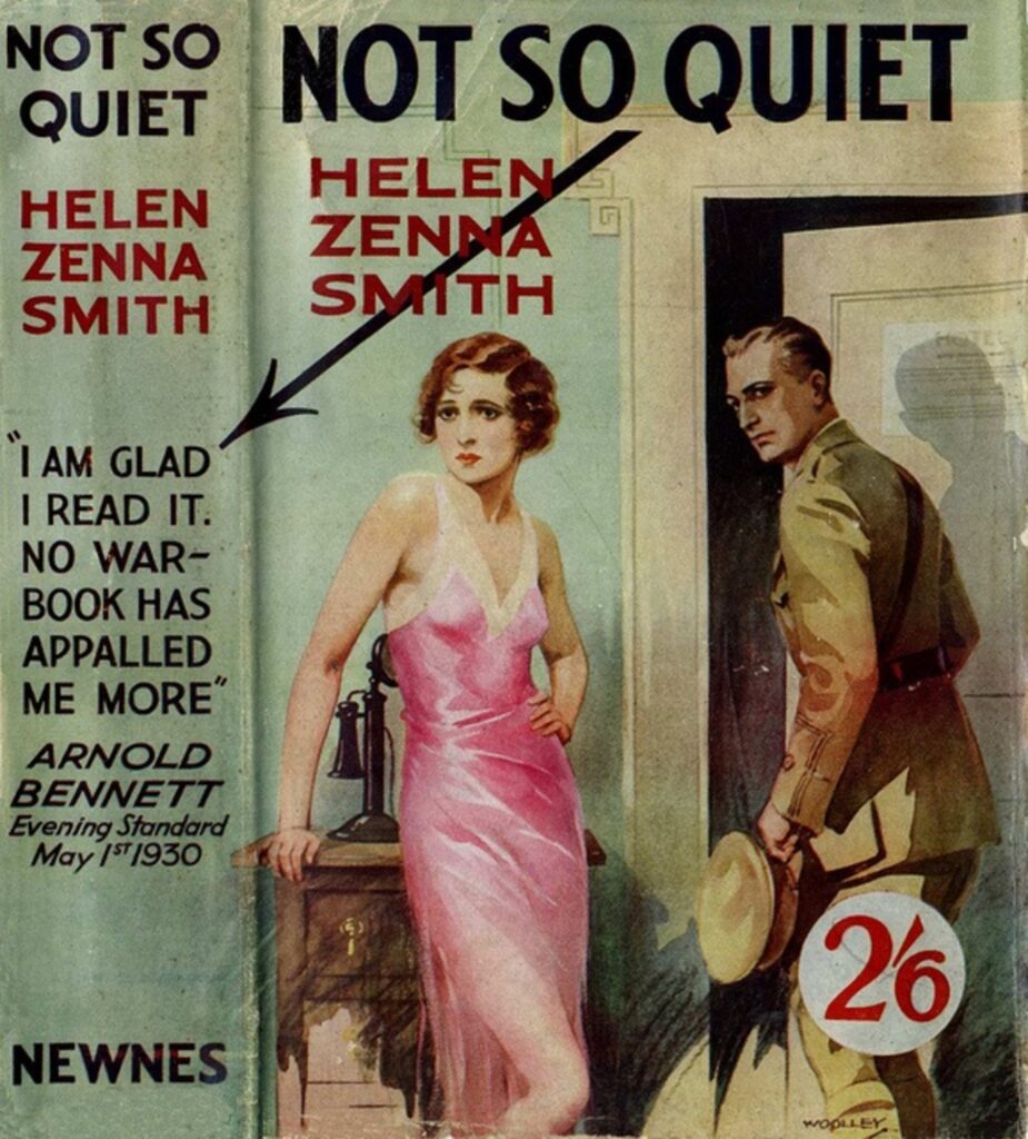
To be honest, if you look at any of the covers of Evadne Price’s other books, the style is exactly the same, which is weird seeing as she chose the pen name for Not So Quiet in order to sort of distance herself from her usual work. Obviously this image has nothing to do with the book, but I think it’s just to generate publicity. People are incredibly inclined to read books about love and lovers in general, so if you advertise the book like this instead of a miserable, gritty account of ambulance drivers, it changes who picks up the book. An example of false advertising like this that comes to mind is one of the original 1977 Star Wars posters, where Leia is posed all sexy and Luke is holding his lightsaber up and his shirt is open so you can see his chest. NOTHING like that happens in the first Star Wars movie, but it was a particular style of sci-fi posters that got people into theaters, so I’m wondering if this is a similar tactic.
A very pulpy cover that is tonally dissonant from the actual book, but covers like these were typical of the era I think. I wonder if Arnold Bennett appalled by the book itself, or the war the book depicts?