
I’m surpised to admit it but I enjoyed looking at the posters in the library a lot more than I expected myself to. I think that they are all interesting since they are over a hundred years old but I think that the posters that have a unique artistic style or unusual wording are the most intriguing in comparison to the stereotypical posters with Uncle Sam and boring messages. I looked up articles to find posters that may corespond to this criteria and I came across this poster by the artist, Edward George Renesch.
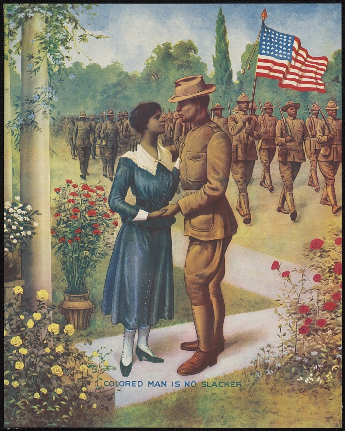
This poster initially caught my eye because of all of the color and lack of any large lettering. There were three things that kept my eyes on this poster in particular. The first thing that surpised me was the fact that this poster is solely comprised of African American soldiers. I had no idea that the U.S government made posters designated for these men. I was then surpised at how concise and not only that but, how small the lettering is. It’s bluntness seems to be an anomaly from what I have seen throughout my voluntary research. It seems as if this wording isn’t meant to incite enlistments through promises of honor, excitement, or glory but solely meant to make the viewer feel pressured or guility. It’s just so straight to the point and visually small that this took me by surpise.
I also found it surprising how much detail went into the natural elements in the foreground and background. Those roses and the vine wrapping around the column have to consitute this poster as having the nicest natural artistic features of any poster from the First World War. Something else that I think is interesting is not about the poster but rather how little information I could find abut the artist. One component that I think is an indication of the lack of information is the fact that this artist does not even have a Wikipedia page.. I admitedly did not spend a large amount of time trying to find information about this man but I couldn’t even find a picture of him. When I looked him up via Google Images, there were only pictures of his artwork. This makes me curious to try find out more kind of like in the “Challenge Accepted” kind of way despite not knowing how realistically feasible that is.
Connor, I’ve never seen this! Great find and discussion.
wow this is a really well-made poster, and I can definitely see how this catches our eyes! Also the text, the churning between each word. I am impressed and scared how uhhh propagandized this war is happening. I mean look at the only text, “Colored Man is no Slacker”?? No wonder Monte got the impression of getting freedom by joining and being a “good little solider boy” that…is low-key infuriating. Very great poster, I might need to check it out myself if its at the archive!! :))
I missed the posters and I appreciate this blog post! I also had no idea that the government made posters that included anyone other than idealized young white men and women (and Uncle Sam). Your discussion on the beauty of the poster is spot-on. I was surprised by how elegant the poster as a whole was, because it contradicts a lot of racist media I’ve seen from this era.
On a side note, the portrayal of women in World War One media as a soothing presence and/or a prize for returning soldiers frustrates me.